So, what was the message in the different typefaces? I have no frakking clue because that was over a decade ago. But to this day, I can identify newspapers based solely on their typefaces. If presented with a stack of 30 different papers, I can pull out the LA Times by looking at just the few lines that fall on an issue’s 1/8-inch fold. There is no productive use for this skill and I have only employed it for purpose of evil.
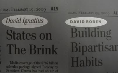
So it’s with great concern that I noticed an alteration in the Post today. The typeface for the columnists’ bylines has been changed.

A few years ago, the Post switched from the classic Century Old Style to something they call Postroman. I think it’s a font they invented themselves. The two are very similar except the latter looks like each letter was squeezed slightly from the sides. The result is a taller character with the serif either pushed closer toward the vertical or compressed into the empty space between the two letters. The old Op-Ed bylines were a larger, italicized and underlined version of the typeface they use for the normal articles.
The new typeface is Helvetica or some variation close to it. Boring old Helvetica. It’s squat and fat in the middle and there is a mile of white space between each letter. It’s also all in caps.
It’s not necessarily bad. But it looks like something cooked up at a Midwestern regional paper like the Des Moines Register in an effort to bring the look of the paper into the 1990’s. We live in a major metropolitan Capital city. The design of our newspaper should look forward into the future and not backwards. It should develop upwards toward the heavens and not forward into the future.


2 comments:
Don't forget the twirling that it ought to do.
... and always twirling, whirling, whirling towards freedom from bad typography!
Post a Comment